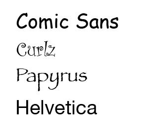
Unfortunately not all typefaces are so stunning and inspiring. In fact, there are some that are absolutely disgraceful. So at work, we always joke about the ones we hate, and unfortunately we frequently see them when some clients send in pre-designed, ugly ads that contain these typefaces. Everytime I see Comic Sans, Papyrus, and Curlz, I cringe - not just at work, but whenever I see them, anywhere.

Using Comic Sans, Curlz and Papyrus is an easy way for people who obviously have no eye for design hope to make something stand out or look "a little nicer." Just because they are a "decorative" typeface and they come stock on pretty much every computer, doesn't mean it will make the design look nice or stand out. It bothers me when companies and people who offer decent, quality services, but use these hideously tacky typefaces.
Now, I have left out Helvetica. I put Helvetica in a different category, because it's not AS bad as the other typefaces. However, Helvetica really annoys me because it is really plain, bland and boring and becomes really ugly when it's bold. It is a classic font, however, and in some instances it looks decent, especially when it is condensed or narrow. I have more respect for the classic typefaces, because they do have their purpose in the design world.
So next time you choose a font on your computer, make the right choice and avoid comic sans, papyrus, curlz, and helvetica. Also, visit: www.bancomicsans.com or order yourself an "i hate helvetica" t-shirt at: www.etsy.com/view_listing.php?listing_id=6097369, or just google these fonts and read the designers' commentaries to realize that the use of these typefaces is blasphemy to the design world!

No comments:
Post a Comment